The Nitrate system
YouTube’s all-in-one messaging platform
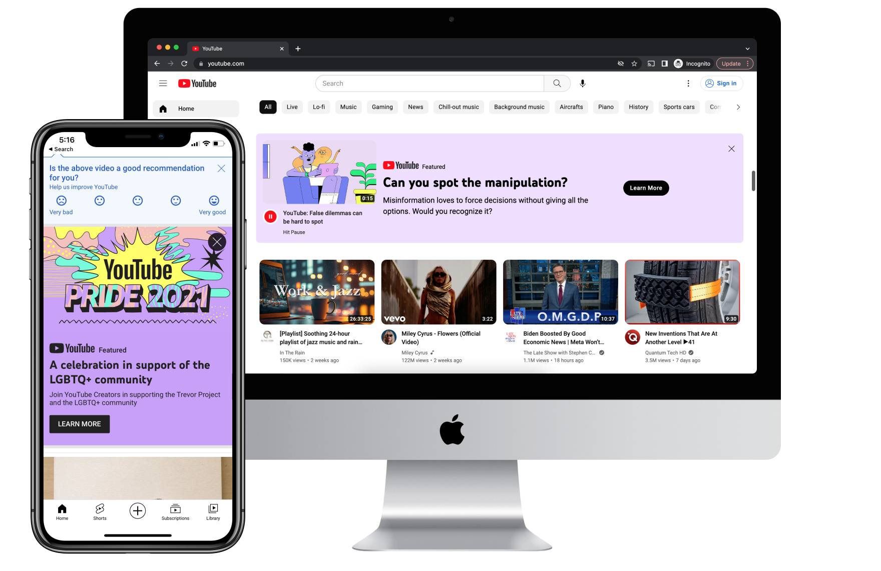
Nitrate is the “The Voice of YouTube” campaign management platform, which supports 20+ message formats on the YouTube homepage and watch feed across web, mobile, and television. Messages can be informational, educational, and promotional.
Nitrate was historically used to promote paid subscription services like Premium, Music, and YouTube TV. Increasingly, Nitrate has been used to share important public service content (in 2020, Nitrate messages containing critical information about Covid-19 were viewed over 400 billion times). Nitrate is also used to educate Music and Premium members about their product benefits.
As the sole dedicated Nitrate UX designer from July 2019 to March 2021, I led designs for new formats across multiple surfaces (mobile, desktop, and TV). In particular, I led the design for a new hero format on the television, and for a new format to highlight important public service content. I created UX guidelines to improve campaign quality and raise awareness of Nitrate system. I evangelized and consulted on the usage of Nitrate throughout YouTube. I also led the redesign of the Nitrate Console – an internal campaign management tool used to maintain thousands of campaigns across all formats.
Statement Banner
In the wake of renewed national attention to systemic racism, it became clear that the existing Nitrate compact banner wasn‘t well-suited for certain types of messages. The new statement banner was designed as a new Nitrate format optimized for urgent, high-visibility, and often emotional messages from YouTube.
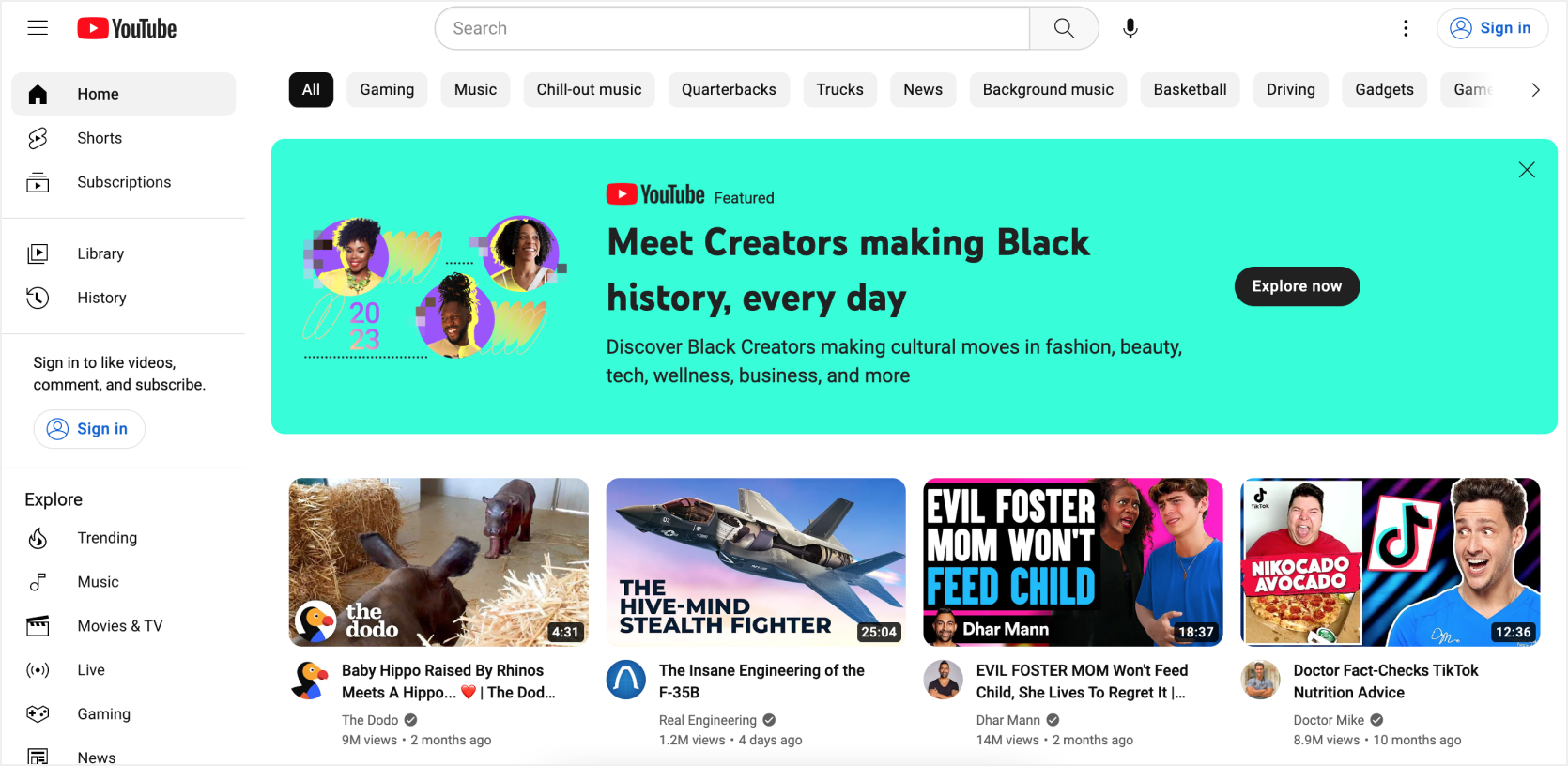
Implemented statement banner on YouTube home page
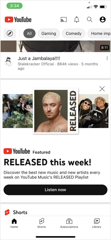
Statement banner on mobile
Step 1: Understand
I worked with PMs, marketing, and UX leads to understand the cases in which existing Nitrate formats failed to effectively communicate key messages. Examples included COVID-19 and racial justice campaigns. It became clear that the existing compact banner format wasn‘t working for some very specific reasons (e.g. it didn‘t align well to the grid). The existing banner also had not been designed with future flexibility in mind, which is a key design principle for Nitrate formats.
Step 2: Gather requirements / explore
I consolidated the design requirements and success criteria, then collaborated with a visual designer to explore possible solutions. The explorations were beautiful and creatively solved the problem. However, many ideas were outside the scope of what was needed. I helped focus on a specific design solution as an MVP that could be available in time for key, upcoming campaigns.
Step 3: Review designs and create spec
I worked with PM, engineering, and VisD to define the MVP. I provided redlines and detailed specs for all possible variations of the format. I also guided the designs through reviews and secured approvals to begin implementation.
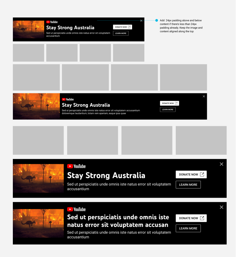
Column sizing and breakpoints for web banner
Step 4: Work with developers and document usage guidelines
I collaborated with engineering, PM, marketing, and VisD to resolve any unexpected issues during implementation (e.g. adding a missing design for the 1 column layout on desktop and adding the word “Featured” for certain campaigns). I also introduced usage guidelines for marketing and created design specs for the Nitrate internal campaign management tool.
“Sheila did an incredible job integrating and responding to multiple rounds of feedback on a very tight timeline... Not only were the specs detailed but her collaboration with eng for implementation on all the new formats was excellent.”
Perf 2020 year-end Director feedback
“You created wonderful designs that will allow YouTube to have its own distinct voice across the platform allowing us to respond in a coordinated and responsive way when events impact our users.”
Spot bonus for Crisis Response Nitrate Formats
Masthead on TV
Nitrate introduced its first promotional format for subscriptions on the television app (aka Living Room), which is the second most-watched YouTube surface. It has driven a +2.1% increase in YTV signups.
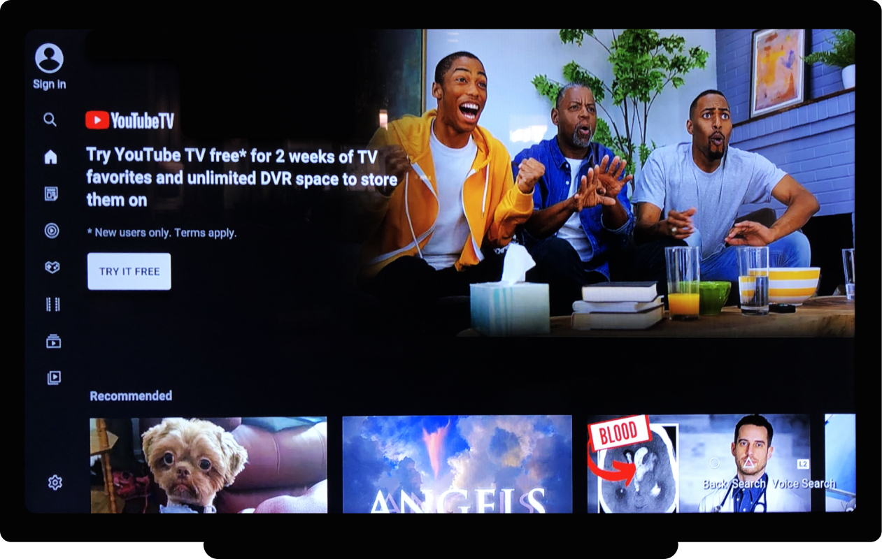
Masthead format on YouTube television app
Step 1: Understand
My PM partners had identified that using a masthead-like format to promote the YouTube TV service on the television app could be a good growth opportunity.
I started the project by collecting relevant design details, including project assumptions, requirements, and potential constraints. I also met with marketing, PM, and eng stakeholders, as well as UX leads to understand television design principles.
Step 2: Explore
I explored various solutions, which I iteratively reviewed with my UX partners and marketing stakeholders. Reviewing the designs helped uncover additional requirements, and eventually led to a solution that worked well.
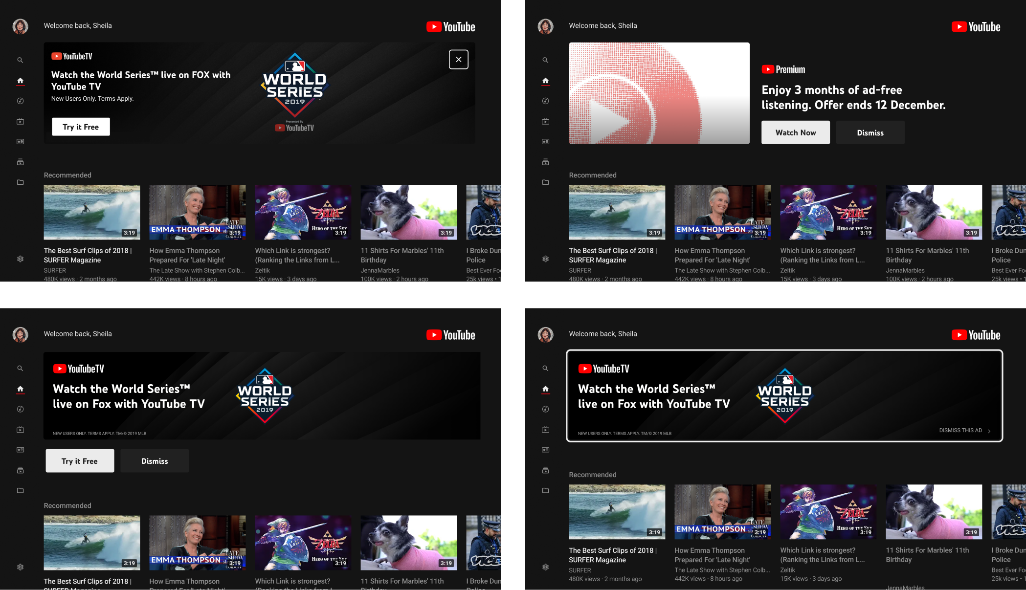
Design explorations for the Living Room Masthead
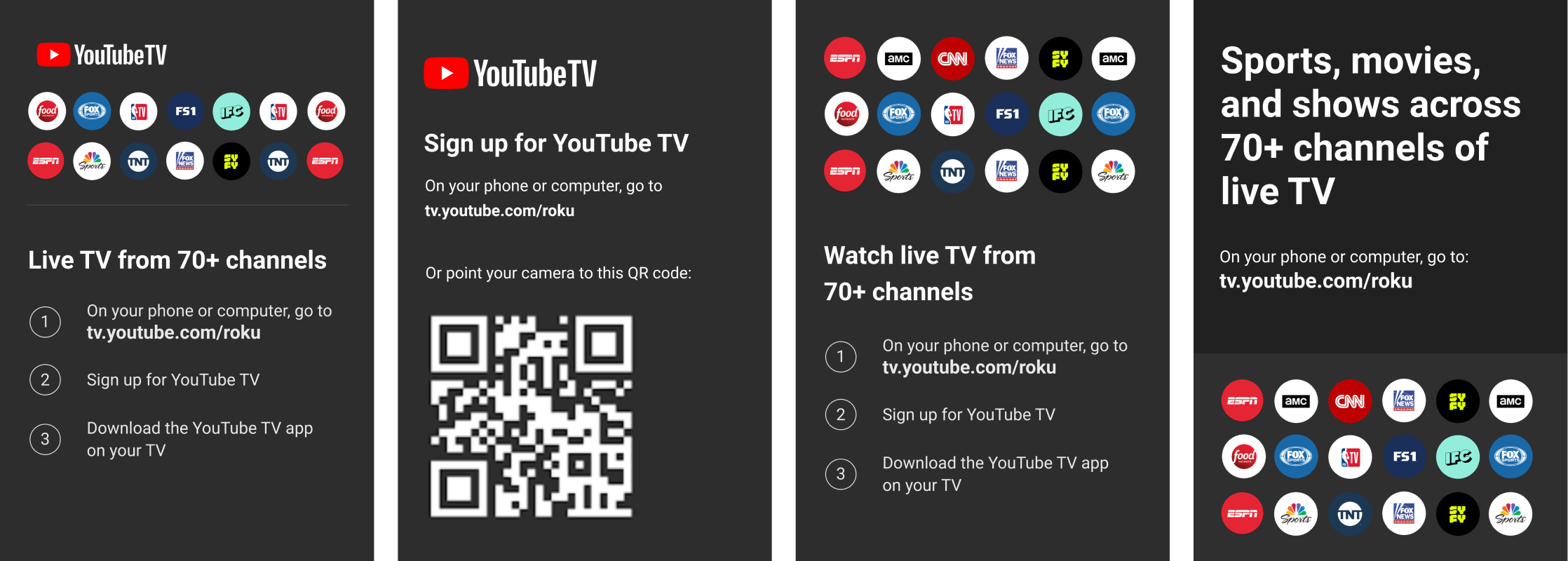
Design explorations for CTA action
Step 3: Create a design spec
I collaborated with UX partners on Living Room to define a solution. I provided detailed redlines and all variations of the format, then iteratively presented the designs throughout a series of reviews until all stakeholders were agreed and we had approval to proceed to implementation. I also shared the design solution for the Living Room Masthead via a rolling deck and spec in Figma.
Step 4: Work with developers and create documentation
I worked with both the Nitrate and Living Room engineers throughout implementation. I also worked with marketing partners to define usage guidelines (including text safe areas, character limits, and asset size requirements) so they would be able to use the new format effectively. I also provided guidelines for the internal Nitrate campaign tool and shared usage guidelines for Marketing.
“Thank you for your work in launching Nitrate Masthead on Living Room! The launch resulted in a significant +2.1% increase in YTV signups.”
Spot bonus for Nitrate Masthead on Living Room
Nitrate documentation
The redesign and ongoing maintenance of the Nitrate Catalog 2.0 involved a visual refresh of the existing version, continually correcting minor mistakes and omissions, adding usage specs for new formats, and introducing new sections with UX guidelines for campaign creative content and copywriting.
I recognized the need for a redesigned catalog and worked with PM to understand constraints and reformat content, and then continually reviewed new guidelines with UX leads. I received two spot bonuses from my peers for redesigning the Nitrate catalog.
The new playbook provided updated usage guidelines based on emerging needs, and serves as a starting point for any YouTube team interested in using Nitrate. It links out to new overview slides as well as new guidelines for crisis messaging. This project involved re-defining the non-subs launch process, simplifying the existing policy documentation, and introducing a new green/yellow approval track system.My role: I collaborated closely with PMs and a PGM to document a new set of policies and approval tracks.
“I've been sharing the doc with everyone on other teams who want to learn more about what Nitrate can do!”
Nitrate engineer
Nitrate recognition
"Sheila is the absolute go-to person for anything Nitrate UX”
Perf 2020 year-end manager feedback
“For going above and beyond to assist others to make them successful or for handling grunge work.”
YouTube UX Award for Citizenship in Q4 2020
